Overview
This project is the continuation of the Design Sprint which I co-facilitated in September 2017 to enhance the shopping experience of Mongeral Aegon’s website.
You can read more about this Design Sprint here.
The challenge
To design and test a whole new experience for the online life insurance purchase process.
Research
At this stage, I compiled all of the data which we already had at Mongeral Aegon.
Accessing Google Analytics
I accessed Mongeral Aegon ‘s Google Analytics account and analyzed data from the purchase funnel, the conversion rate and the user behavior within the site. I was then able to see where the gaps were and identify the biggest drop-out point: the Checkout.
Analyzing NPS 2017
I conducted a study on the results of the NPS 2017 (Net Promoter Score), where I tried to understand what our customers were saying about our site, what they thought was good and, more importantly, what they thought was bad.
The Survicate Tool
I gathered in-site feedback from users using Survicate. With this information, I was able to find out if the user had any difficulties during the purchase process and to understand why he left the flow.
Learning from past Design Sprint
I also checked all the material produced in the last Design Sprint, which served as a good source of information and was helpful as a starting point for this project.
Benchmarking
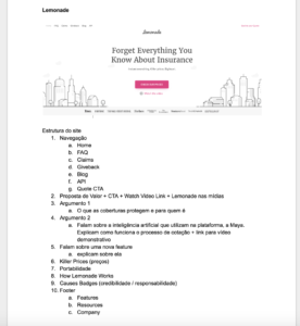
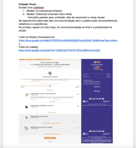
I researched how direct and indirect competitors sell life insurance. I documented everything in Google Docs, where I wrote notes on the positives and negatives, trying to understand why certain experiences were good and some bad.
Examples of benchmarking.
User Flow
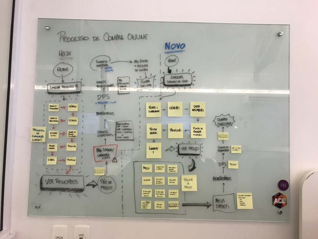
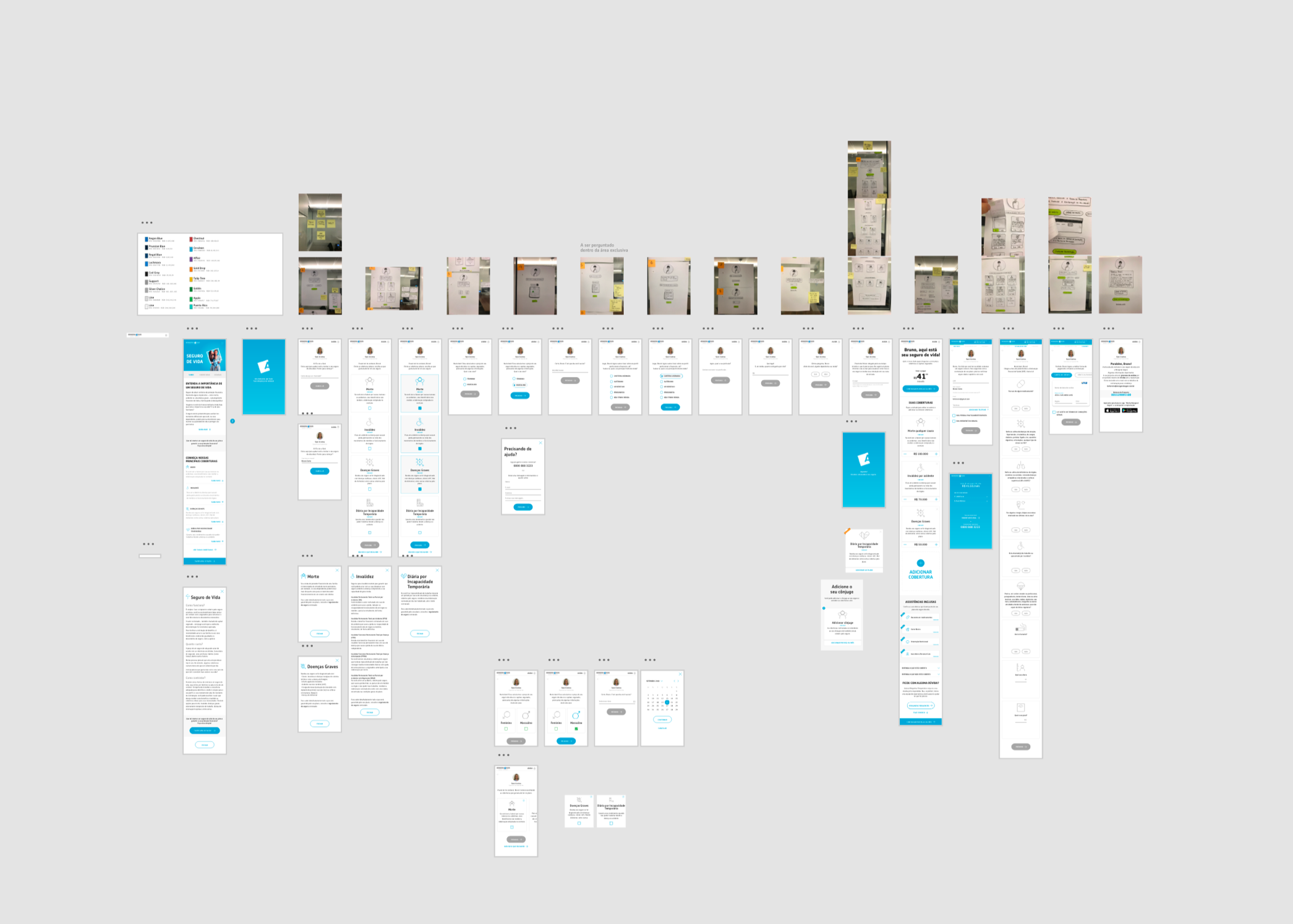
Alright! With all of the research done, I was ready to take the information to the drawing board. I start by drawing the current purchase flow, on which I identified all of the pain points.
The next step was to design the first version of the new purchase flow, based on all of the research done previously.
Currently User Flow vs New.
You can see here a big difference between the two flows. The main one being the number of steps in the Checkout. While the current flow has 7 steps, the new one has only 4.
A brief story
I had spent the whole day creating and developing the new purchase flow, and as a result, I got a very bad headache.
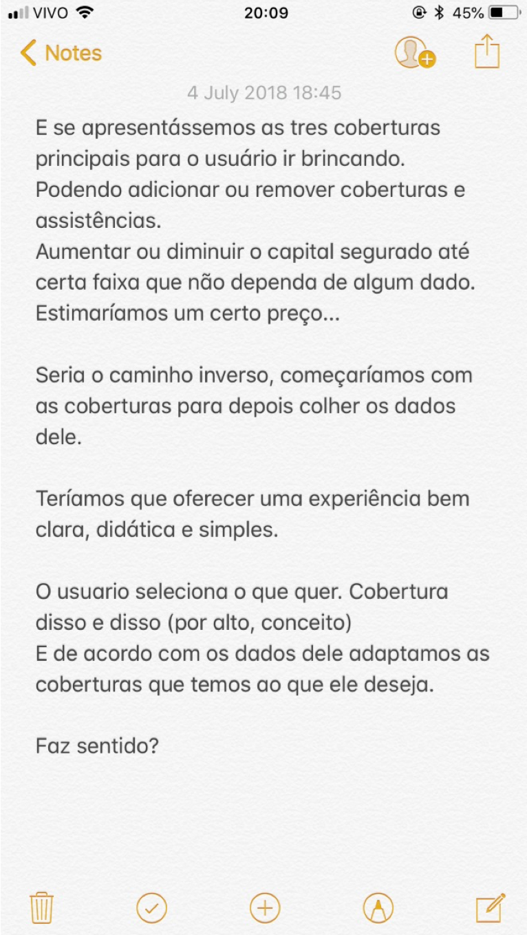
On the metro on my way back home, my head wouldn’t stop working. A lot of ideas and questions passed through my mind.
Suddenly, the light came on:
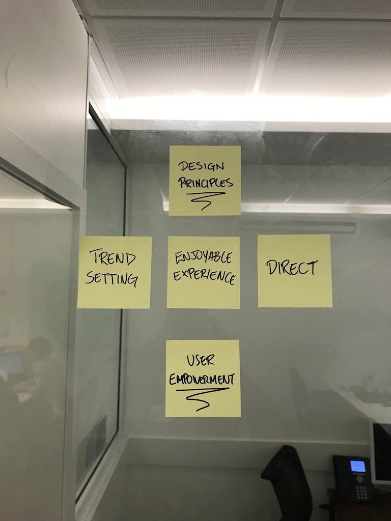
Why don’t we give the user the power to choose? Why don’t we let them choose what coverage they wants before collecting their data? Why not empower them?
Does this make sense?
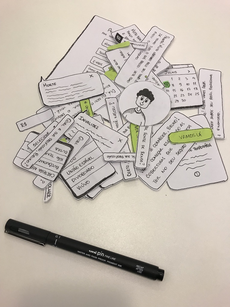
Paper, pen and scissors
After the research and reflection stage, it was time to get my hands dirty and start creating a new look for this new experience.
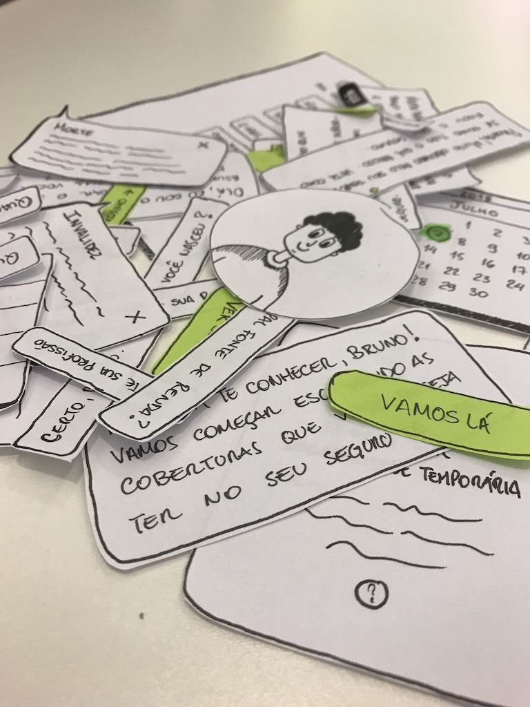
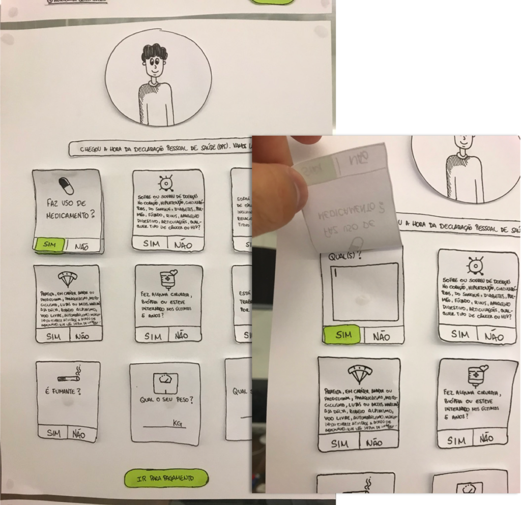
The process that I followed was to sketch the flow, cut each element into individual pieces, and glued them onto paper to represent the different stages of the flow.
Sketches.
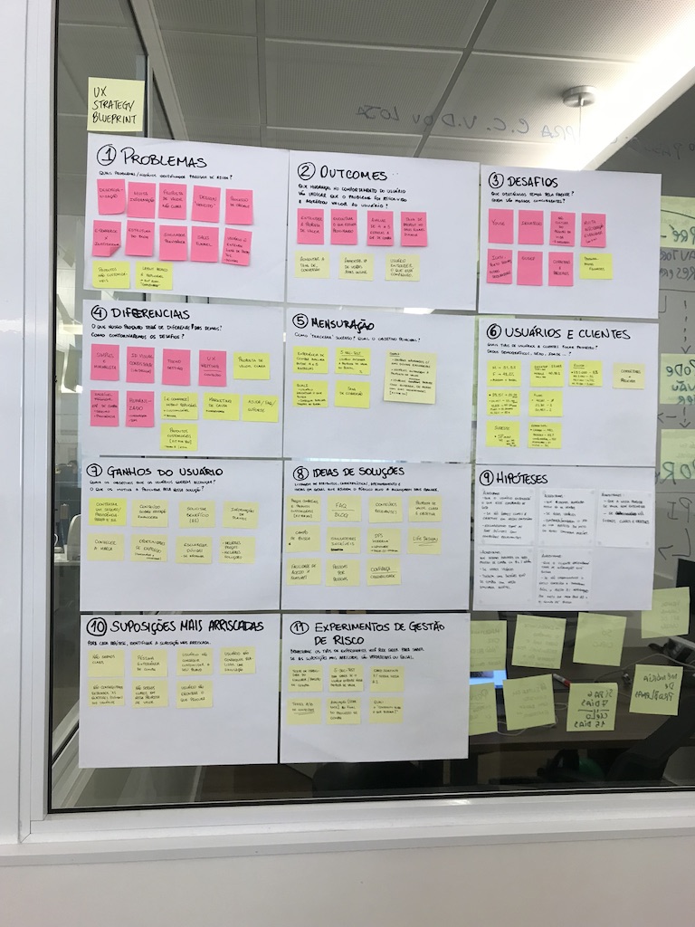
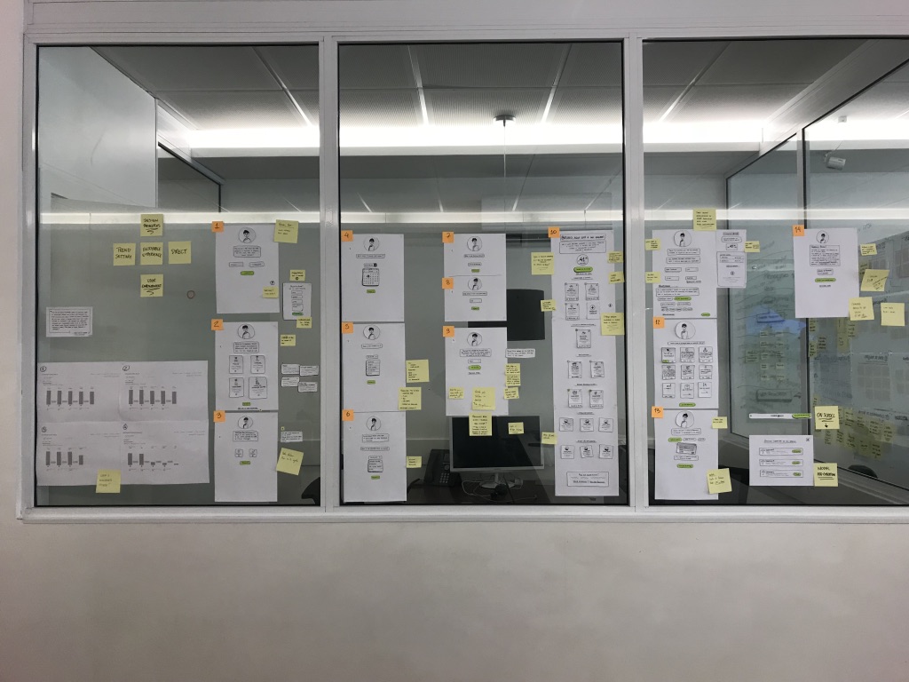
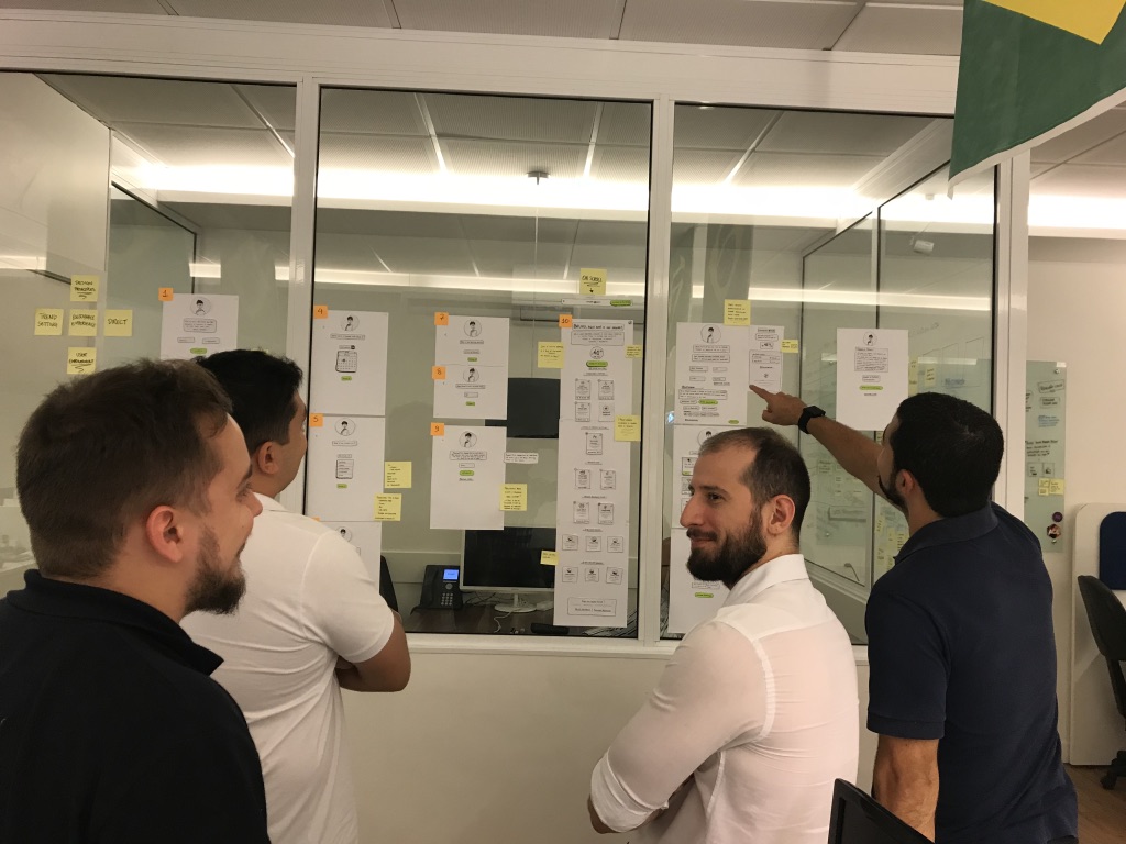
I then stuck all of the pages onto the wall for a better perspective, also increasing the opportunity for the design process to become even more collaborative. Various co-workers: designers, developers, business partners, etc, came to look at the project and, using post-its, collaborated by adding their feedback, suggestions and ideas.
This activity created enormous flexibility of iteration and enabling me to make the necessary changes to achieve the sketch validation.
Wall of Sketches.
With the sketches stuck on the wall, the process became collaborative.
Details matters!
Protótipo Mi-Fi
With the screens ready, I started prototyping:
-
First, I prototyped in Adobe XD to validate the flow;
-
Then, I used Protopie to have a medium-fidelity experience.
Video of the mi-fi prototype.
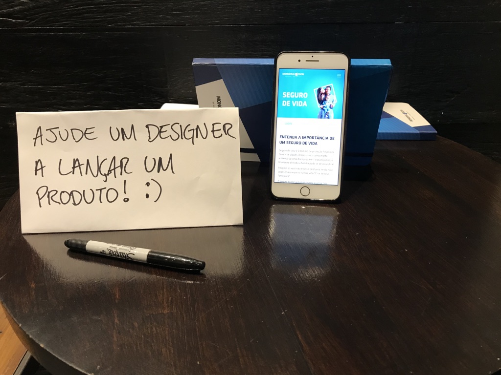
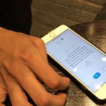
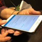
Guerrilla Testing
Because it was a prototype of medium fidelity, the animation and not all of the interactive functions were working.
The aim of the test was to check if the flow made sense and was easy to complete.
What did we want to find out?
-
Level of ease / simplicity to complete the flow
-
User behaviour
-
Information (content): what was missing?
-
Usability, as far as was possible with this prototype
-
Feedback on the look and feel (UI)
What did we find out?
Usability Issues:
-
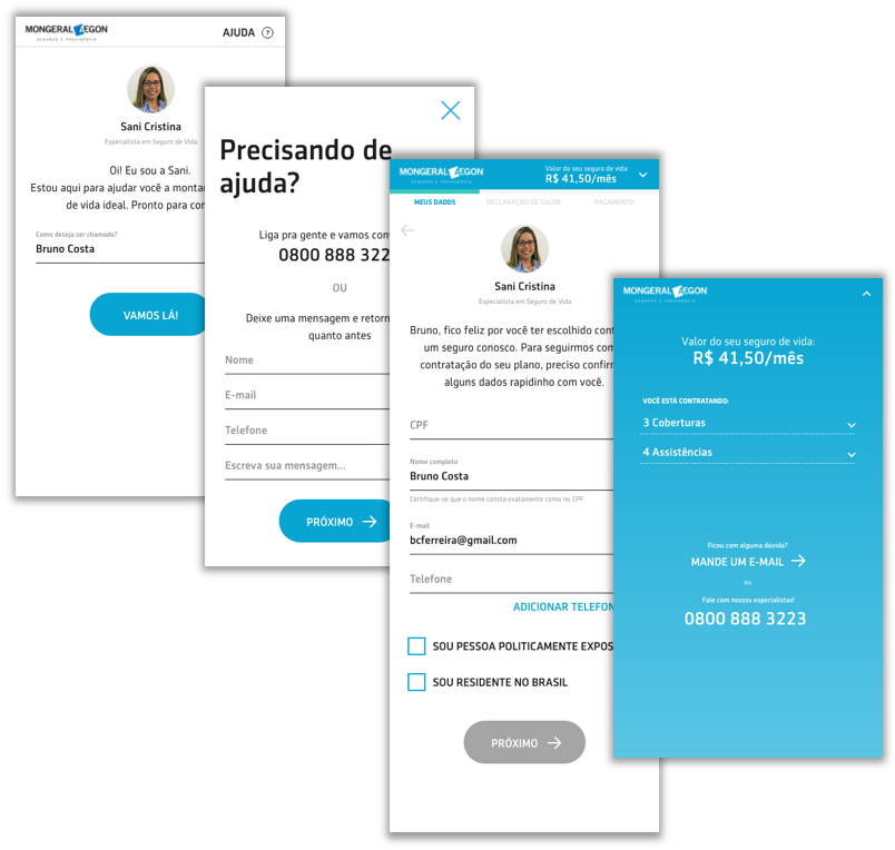
Some users had difficulty initiating the simulation process. They didn’t see the “Name” input field and went straight to the “Go” button;
-
Difficulty in returning to an earlier step;
-
Difficulty finding the “Help” link in the header;
-
“The 0800 phone number could be more visible.”
Content:
-
They missed information about some topics. Example: “What is a politically exposed person?”
-
“Does how I answer in DPS impact the price?”
-
Users liked the look and feel. They liked the blue color.
-
“The experience was easy and simple.”
-
“I thought it was cool to have a person’s photo on the screen. It’s like she’s talking to me. I’m not talking to a machine. The language is friendly.”
-
“I found it very intuitive.”
-
“I liked the icons you used.”
Conclusions
Content is one of the most important points.
The more detailed we are, the better. Little things, for example, a simple note indicating that what is answered in the DPS may have an impact on the price and will undergo an analysis, would help the user. I’m referring to this point because one of the participants said that this might make them give up on the purchase.
We have to be more transparent and objective with our communication methods.
Yep! Interactions and animations help in the effectiveness of the flow and using them in combination with good content and an effective usability design will provide the experience that we want so much to offer.
Next steps
-
Iteration – based on tests carried out, promoting changes;
-
Prototype Hi-Fi – develop it with the team of developers;
-
Conduct Beta tests with potential users
-
Track and evolve;
-
Start thinking about the structure of the new Mongeral Aegon website in its entirety (new content pages, homepage, etc).
Thank you for taking a look at my work.
🙂
