Overview
Mongeral Aegon is an insurance company for almost 200 years and by 2013 it was the pioneer in selling life insurance on its website.
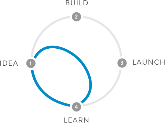
In 2017, in order to improve the user experience during the purchase flow and thereby increase the number of online sales, a Design Sprint was organized in partnership with the Aegon Center of Excellence, the CoE.
This was the first Design Sprint I attended and had the honor of co-facilitating with my co-worker Helen Arvanitopoulos from CoE.
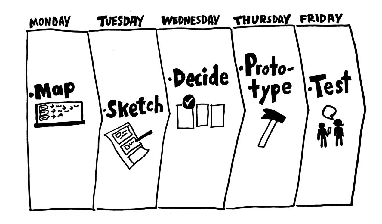
In this sprint, we use the first version of the methodology.
Day 1 – Map
Goal set
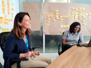
After a brief presentation of each participant and contextualize what we would do during the week, we started the first exercise, to define the sprint goal.
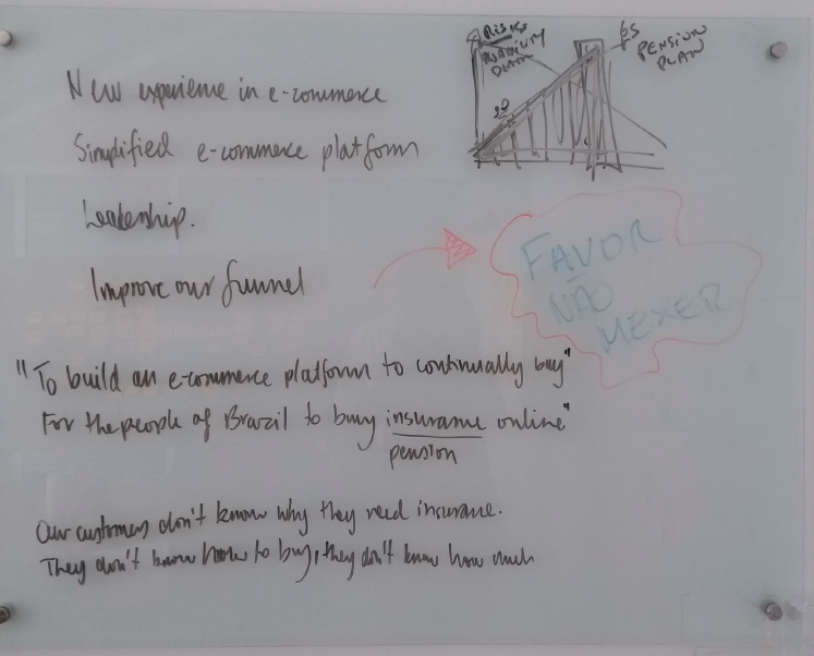
For this, each participant talked about the goals they expected to reach at the end of the week and their expectations about the new e-commerce experience.
After the discussions, the participants defined the main goal and wrote it on the board.
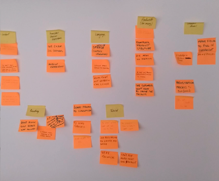
Mapping problems
The goal defined, it’s time to map the problems.
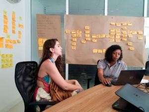
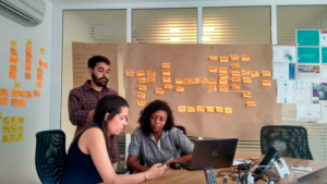
Each participant wrote down in post-its the maximum of problems from the current website experience. They had five minutes to complete this exercise.
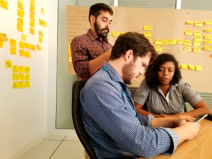
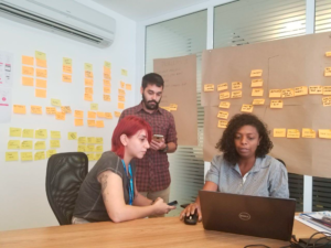
One by one, the participants stuck the post-its with problems on the wall and then group them in categories. This categories part is interesting because of that way participants read all the problems with attention.
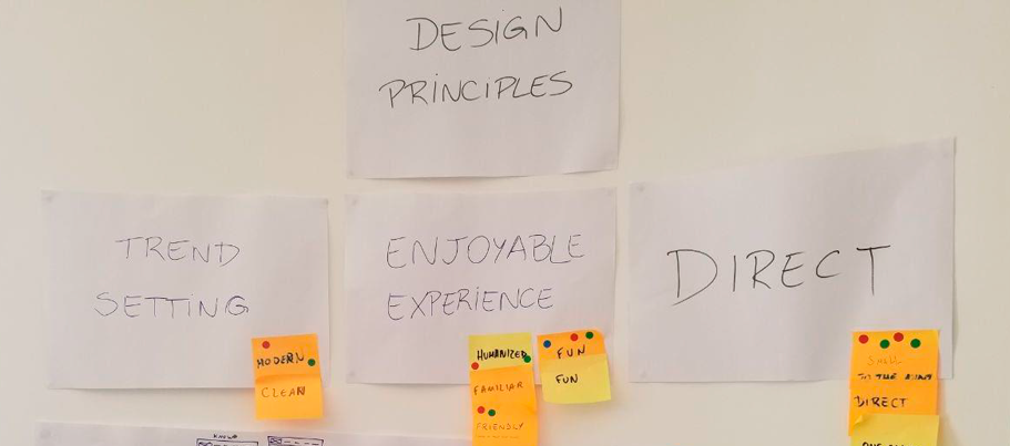
Design Principles
We moved to the next exercise: Design Principles
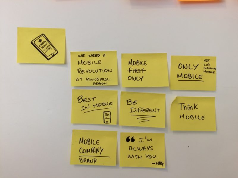
At this time, the activity was to write down in post-its, from one to three words, what is expected from the new e-commerce, in five minutes.
Time’s up! It was time to vote!
Each participant has two votes and from the most voted ones we came out with the three Design Principles that the final product of this sprint should have:
- Trend Setting
- Enjoyable Experience
- Direct
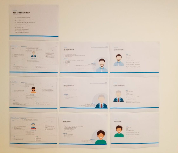
Target
With the design principles defined, we started to talk about the target audience. A study about audience and personas was accomplished before making this step easier. Thus, the group decided to focus on the person of the Millennials.
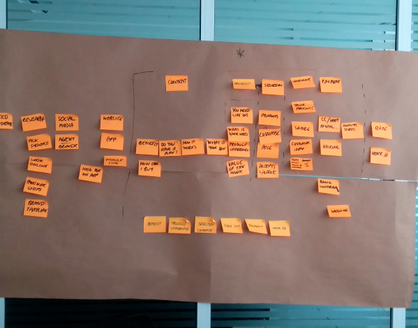
The Map
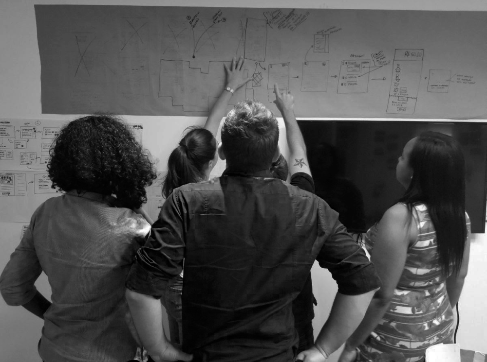
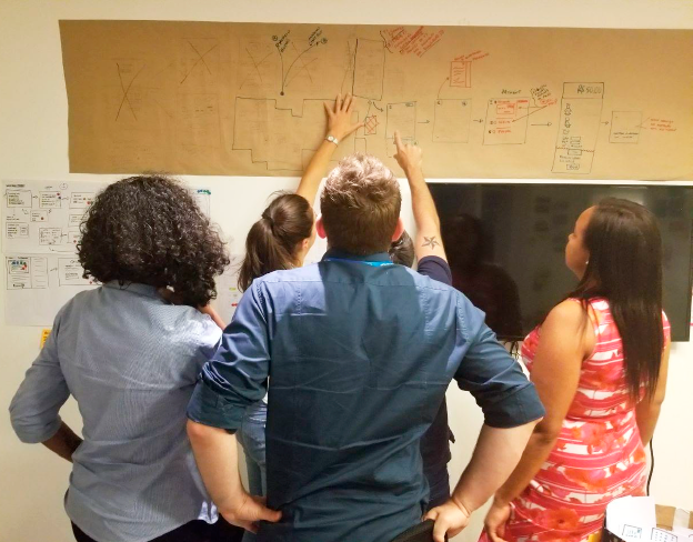
At the end of the first day, we set up a map with the ideal user flow, since when the user thinks they desire our product until the purchase.
We split the map into steps and then the participants had to decide where to focus on for the rest of the sprint.
Finally, product offer and checkout steps were chosen to focus on during the next sprint days.
Day 2 – Sketch
Benchmarking
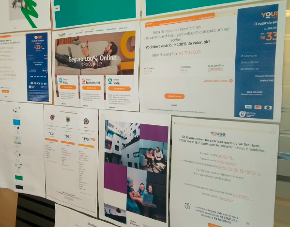
We started the second day with all participants doing benchmarking research to find functionalities and get insights to use as a reference inside the project. After the estimated time, individually, they presented what they found and glued to the wall.
4 Steps Sketch
Time to sketch some ideas!
The first step was to take some notes about everything we did before: the main goal, the problems mapped, opportunities and all the inspiration collected in the benchmarking. The participants, individually, were walking thru the room, looking at the walls and taking notes. They had 20 minutes.
These notes are likely a collection of the “best hits” of the first 24 hours of the sprint. It was very good to refresh the participant’s memories.
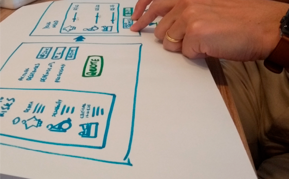
Then, they had more 20 minutes to write some basics ideas, draw some sketches, make experiments, anything that gives form to their thoughts.
The third step was to explore alternatives ideas with the “Crazy 8s”, an accelerated exercise where each participant picks up one sheet of paper and folds it into 8 pieces. There were 60 seconds per section to make sketches, a total of 8 minutes in which 8 sketches are created.
Finally, they had around 30 minutes to refine the designed solution – a single well-formed concept and all the details defined.
With everything done, the finished sketches were placed in a pile and stored for the next day.
Day 3 – Decide
Art Museum
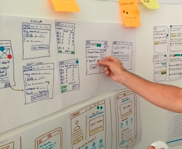
The sketches were glued to the walls to look like an art exhibit. So each participant can take a good look at each sketch presented.
Heatmap
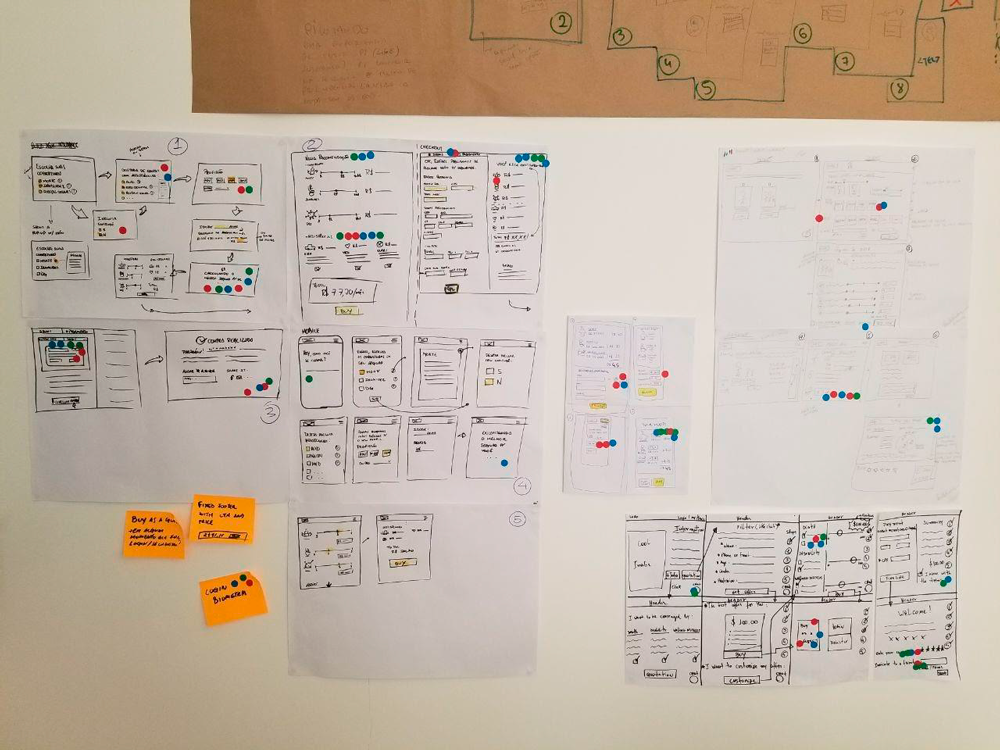
Before the team started looking at the sketches, we gave everyone a handful of dots stickers (around 15 for each one). Then everyone walked around the room, in silence, observing the sketches and putting stickers dots next to the parts they pleased.
This was a simple activity, but it forms the basis for the decision.
Storyboard
After the vote, we analyzed the most voted functionalities and drew a unique flow gathering the best ideas.
During the storyboard, I made a question to the team: “What we are developing is meeting the three design principles we defined earlier?”
The team realized that we were not being “Trend Setting” and, after discussion, we concluded that the thought should be “mobile only” instead of “mobile first”, which meant that every proposed solution must be started from this reality in order to Mongeral Aegon become the first mobile insurer in Brazil.
Day 4 – Prototype
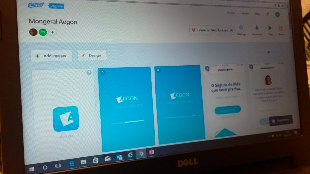
We started the day by developing the application prototype.
The team was divided into tasks:
- development of screens and the interaction of the prototype (which I was responsible for);
- content development;
- analysis of the technical implications;
- recruiting people for the test;
- and script creation of questions for testing with users.
We finished the day with the prototype ready to be tested with users, the script of the research created and 6 people recruited for the test.
Day 5 – User Testing
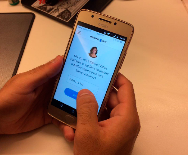
We scheduled 6 interviews throughout the day with a duration of 1 hour.
During each interview we had 3 staff members present:
- the interviewer who explained how everything worked and what the user should do;
- the cameraman capturing audio and image with a focus on user interaction with the smartphone;
- and a third person taking notes of participants’ responses and insights.
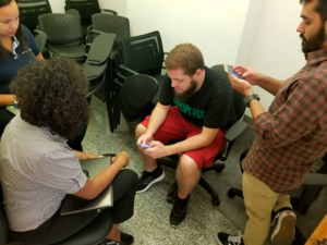
Fotos dos testes de usuário realizados.
Insights from surveys
The navigation was perceived as easy and intuitive. It will be necessary to validate this perception by testing a high-fidelity prototype.
Another point to be worked in parallel is the overall content present in the site navigation flow.
Some lines of interviewees:
“What I liked the most about the app is that it does not need an intermediary selling me, I can simulate it myself and see the price variation.”
Mônica, 52, Economist
“I did not understand if these assists were already included, I would click on the icons to know more.”
“I like this conversation model, it’s a trend.”
Eduardo, 31, Public Employee
“I found the app quite straightforward, but the criteria for calculating the personalized recommendation was unclear.”
Maíra, 26, Student
“I would like to have more information on the coverages. You could have a help field on the recommendation page or external link. ”
Pedro, 23, Student
Next steps
From the test results, create a high-fidelity prototype in code, and conduct new user testing.
Thank you for taking a look at my work.
🙂
