Overview
This a project developed for a partnership between the Brazilian publishing company, Abril, and Mongeral Aegon, a Brazilian life insurance company, states that six magazines have their own life insurance e-commerce.
Mongeral Aegon is the pioneer in selling life insurance 100% online in Brazil. With this partnership, the publishing company would sell life insurance to its different audiences, using the insurer’s online insurance sales expertise.
Therefore, each magazine would have its own e-commerce offering a specific and customizable life insurance.
First meeting
An initial meeting took place with the stakeholders and the UX team, in which we discussed the presented brief and started the ideation process.
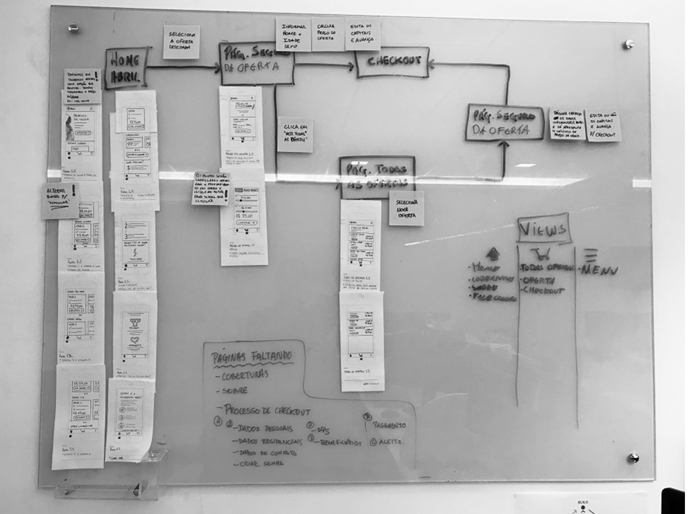
We went to the whiteboard and started to draw some flows and sketch ideas.
During the meeting, we decided that it would be more efficient to create only one e-commerce with the details of the individual magazine’s offers. In this way, we removed the need for six different stores.
Finally, the goal was defined.
Goal
To design a new e-commerce experience to sell customized life insurance packages for the magazine’s target audience.
Research
This first phase is important to understand who is the audience of the product, their pains and needs are.
For this, we studied the official Project Document that contained information about the life insurance products to be offered and the target audience of each magazine.
Structuring with Sitemap
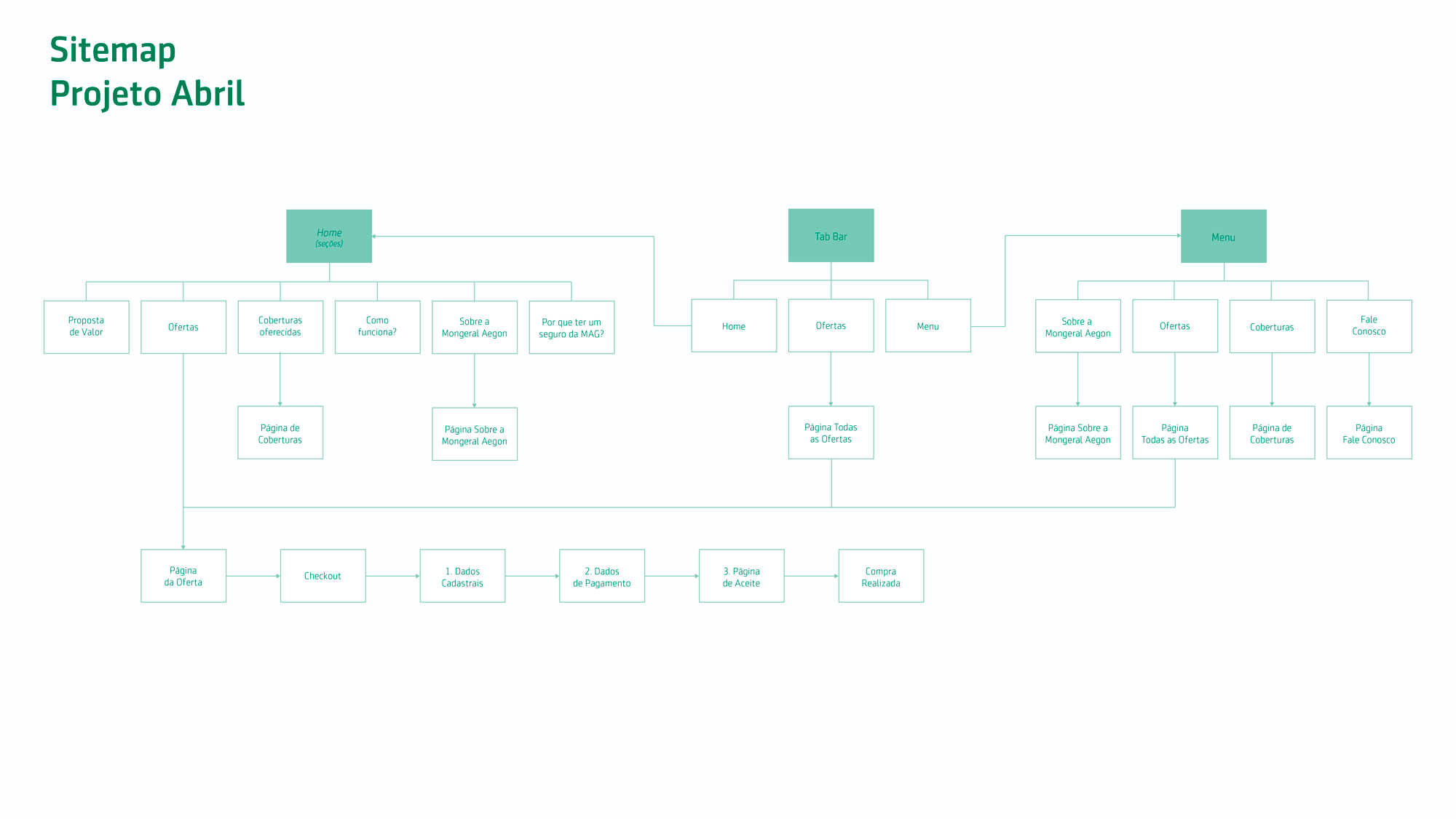
Still, in the research phase, another action was to organize hierarchically the pages of the site into a Sitemap, which helped us to visualize the primary structure and navigation between the different parts of the system.
Get paper and pen, it’s time to sketch!
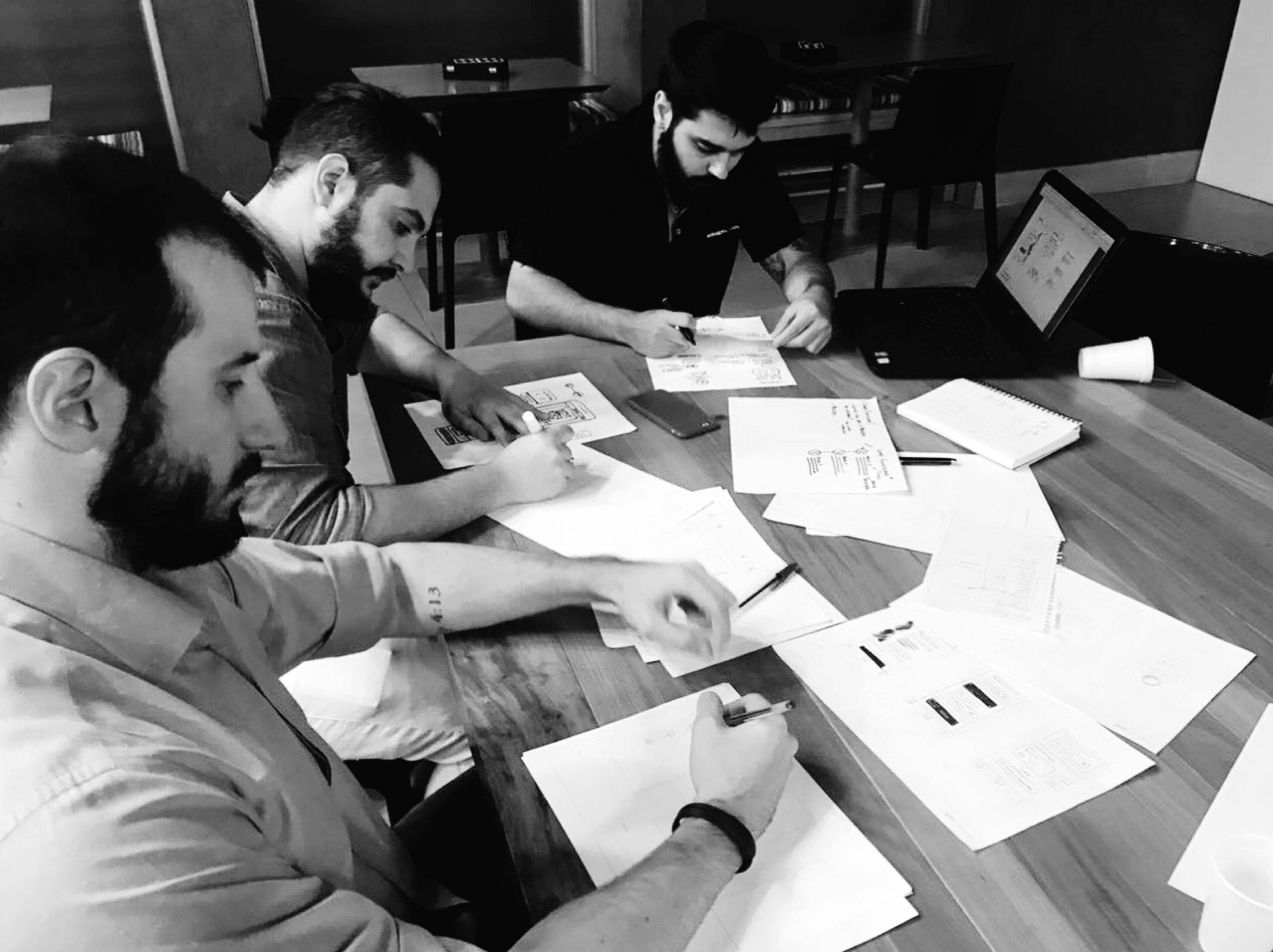
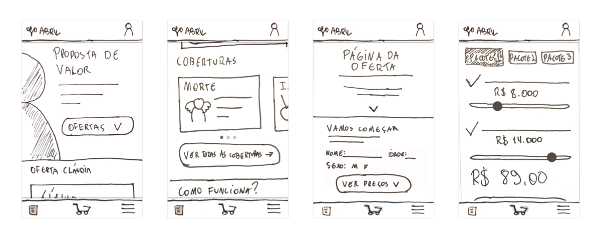
Now, in the ideation phase, we started to sketch ideas on paper.
At this point, my UX colleagues and I started to sketch some ideas, consulting references and getting insights.
Sketching sessions were carried out until we reached our final design. One interesting thing about these sessions was that we were exchanging feedback all the time and improving our final solution.
Always validating
From sitemap to user flow and sketches, an important point of the project is that we always validated our advances with the stakeholders.
The first prototype
After everything validated, we began to create a lo-fi prototype with the e-commerce sketches.
Our goal with this prototype was to do user testing before moving forward to the next phase.
Video of the prototype.
The very first user testing
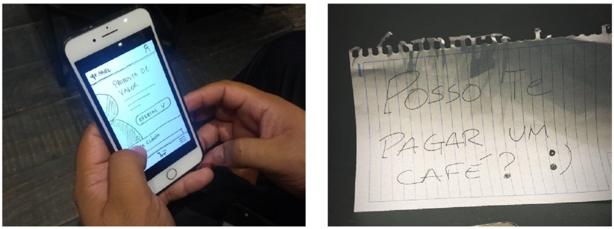
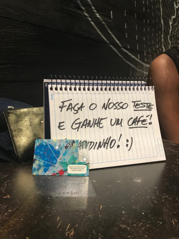
We went to a coffee shop to test the prototype.
I sat with a sign offering to buy customer’s a coffee, which received a lot of interest.
On accepting my offer the customers carried out the test in exchange for their coffee.
These early tests helped us to validate hypotheses. For example, was the purchase flow simple enough to carry out a contract?
With the result, we realized that the flow was as simple as we imagined. However, we realized that we needed to make clear the purpose of the partnership between the publishing company and the insurance company.
Wireframing
Lo-fi prototype tested and validated, it’s time to move forward and transform it into a wireframe.
Prototype it and test it… again!
Following the same steps we did in the sketch phase, we prototyped the wireframe (mi-fi) and went to test it on the streets.
We ran a Guerilla User Test and it was very useful.
We confirmed once again that the flow of purchase was simple and intuitive. But we still needed to improve the e-commerce texts and make our value proposition clearer.
User Interface and a hi-fi Prototype
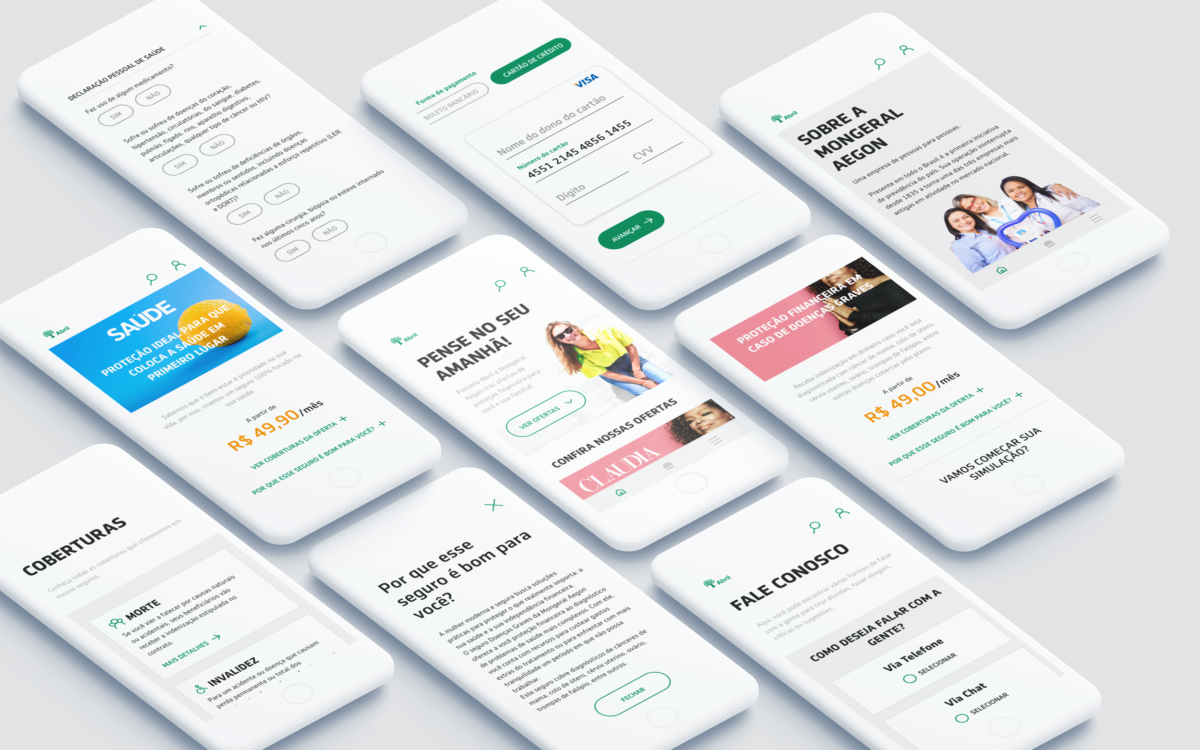
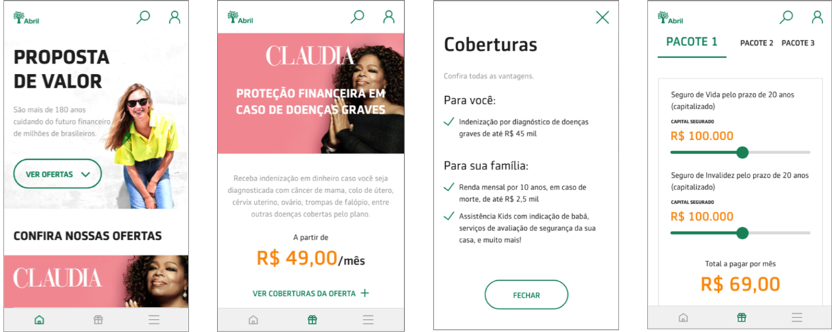
Wireframe tested, adjusted and validated. It’s time to focus on the UI. We designed the interface following our style guide: Life Design.
We strive to design a simple and fluid interaction in order for the user to have a great experience while browsing the site.
Therefore, each interaction was carefully thought out and we reproduced this in the high fidelity prototype.
Video of the hi-fi prototype.
All set!
We went back to the street for more user testing and validate our product.
With the test results, we made the last adjustments and forwarded a tested and validated product for our Developers to work on.
Link to prototype:
https://share.protopie.io/QqpdivozrrR
Thank you for taking a look at my work.
🙂
